| Using tables, you can divide your page into multiple columns, making the page layout look more like that of a magazine or newspaper. All you have to do to make two columns, for example, is create a table that is 100% of the width of the page and that has one row and two columns. You can have any number of columns this way, but remember that some people have small screens and the more columns there are the more difficult it might be for people to read your page. | Unlike in word
processing programs, Composer won't automatically balance
the length of your columns as you enter text, so you will
have to play a bit to get the columns to come out roughly
equal in height. Here I am using a one row, two column
table with the vertical alignment for the row set to
"top." The table has a cell spacing of 7 pixels. You
can, of course, also use images in tables like this. Make
sure that the columns are each set to be 50% of the table
width. |
 All
of you worked hard to master tables, but SeaMonkey has another way
of laying out objects in a page. The method is called "Layers", and
it uses the three icons on the far right of the Format Toolbar.
All
of you worked hard to master tables, but SeaMonkey has another way
of laying out objects in a page. The method is called "Layers", and
it uses the three icons on the far right of the Format Toolbar.  on
top of each other, and they will stay that way no matter how the
browser window is resized. To make an object into a layer, click on
the object (use "Table -> Select -> Table" to select an entire
table), then click on the "pushpin" icon (the left-most of the three
layer tools). That will make the object into a layer. You can move
the object by clicking and dragging a tab that appears above the
item. The tab is easy to spot because it has arrows pointing in four
directions.
on
top of each other, and they will stay that way no matter how the
browser window is resized. To make an object into a layer, click on
the object (use "Table -> Select -> Table" to select an entire
table), then click on the "pushpin" icon (the left-most of the three
layer tools). That will make the object into a layer. You can move
the object by clicking and dragging a tab that appears above the
item. The tab is easy to spot because it has arrows pointing in four
directions.
|
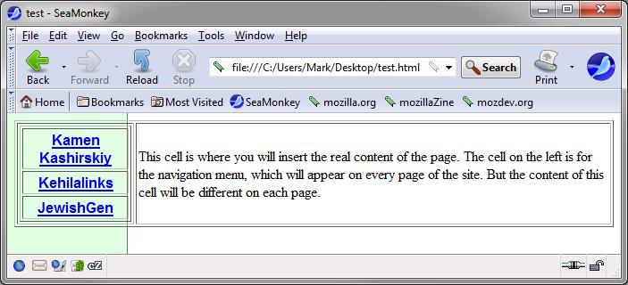
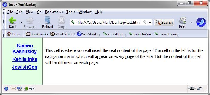
This
cell is where you will insert the real content of the
page. The cell on the left is for the navigation menu,
which will appear on every page of the site. But the
content of this cell will be different on each page. |

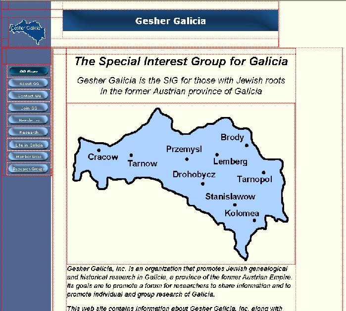
A 2-column table overlayed on top of the background aligns the
navigation buttons on top of the blue bar. Another table aligns
the small logo and the title bar image at the top of the page.
Additional cells in each table are used to provide constant
spacing between elements on the page.
 |
 |
 |
|
|
|
|
|
|
|
|
|
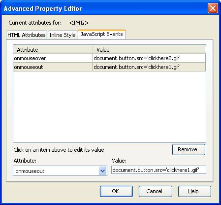
 This kind of animation in web pages is usually done
using a programming language called "JavaScript". If you aren't a
programmer then learning how to program in JavaScript can be quite
complex but, using Composer, we can easily include enough JavaScript
in our web pages to make links and images change colors.
This kind of animation in web pages is usually done
using a programming language called "JavaScript". If you aren't a
programmer then learning how to program in JavaScript can be quite
complex but, using Composer, we can easily include enough JavaScript
in our web pages to make links and images change colors.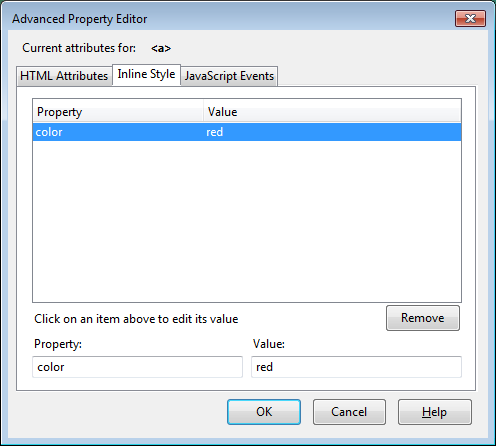 The last step is to make the link text red to start,
so it seems to change back and forth between red and orange as the
mouse moves over it. To do that, once more open the Advanced
Property Editor windows for the link and click on the "Inline Style"
tab. In the "Property:" area, type "color" (without the quotes). In
the "Value: area, type "red" (without the quotes). Then click "OK"
to save the value. (Note: No single quotes here.)
The last step is to make the link text red to start,
so it seems to change back and forth between red and orange as the
mouse moves over it. To do that, once more open the Advanced
Property Editor windows for the link and click on the "Inline Style"
tab. In the "Property:" area, type "color" (without the quotes). In
the "Value: area, type "red" (without the quotes). Then click "OK"
to save the value. (Note: No single quotes here.)

 |
 |
. (You might also notice that I put a link to
Kehilalinks on the image.) Do you see how the text color changes
(and dots appear) when you move the mouse over the image? That's the
web browser swapping one image for the other. | Top of the page | Back to the Course Outline |
Copyright © 2009, 2010, 2012, 2013, 2014, 2016 Mark
Heckman. All rights reserved.